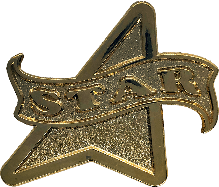
Use simple fonts whenever possible (Arial, Helvetica, Myriad and similar fonts work wonderfully). Avoid complicated fonts as they are often unreadable at actual size. You may think blocky fonts like Helvetica aren’t exciting enough, but they can look really great, and you have to ask yourself, “Do I want people to be able to read the text on my lapel pin or not?” If the text is large enough or it’s OK to make the text in the metal finish, more complicated serif fonts become possible. Small text is usually made in metal or if necessary, silk screened for clarity. While using a silk screen or offset print process makes complicated fonts much more doable, these processes reduce the jewelry-like quality and perceived value of the pin. Silk screens are not available on every finish and type of project and should be avoided when possible.
To ensure you get the fonts you need, either a) provide us with a vector file with outlined fonts, b) allow our professional Graphics Department to pick out the most appropriate fonts for your project, or c) supply us with the font files with your submission, and bear in mind the limitations inherent in the technology and size. There are thousands of fonts on the market, with more appearing every day, so it’s impossible to own them all. If you don’t have the font files and are flexible on font selection, let us know that too!
Uppercase letters work much better when cut in metal than lower case, due to the “holes” in some lowercase letters (i.e. e,o,b and p) tending to close up, which makes the letters less readable, and blocks background colors. Some lowercase letters (i.e. p, q and g) are also problematic in that the “tails” can make the artwork look awkward, stilted or simply unbalanced, especially around curves. For this reason, unless you specify otherwise or we are recreating a logo, we almost always make the text uppercase. Don’t worry, production doesn’t begin until we have your approval. We want you to be happy and proud of the final product!


